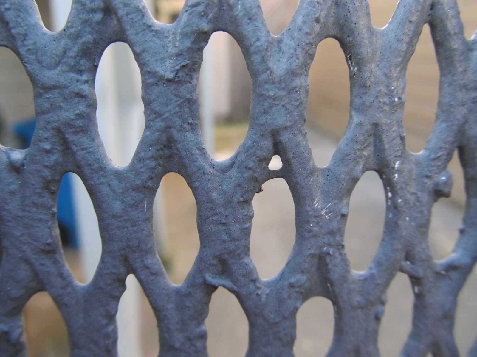
For this post, i collected 3 sets of photos, and made each of the 3 into a collage. I did a collage showing my best of horizontal(the first), my best of vertical (the second) and the best of the close up series i had just done ( the third).
Drew Photo Hadley
Wednesday, May 28, 2014
Grids
For this post, i collected 3 sets of photos, and made each of the 3 into a collage. I did a collage showing my best of horizontal(the first), my best of vertical (the second) and the best of the close up series i had just done ( the third).
Thursday, May 22, 2014
Close Ups Draft #4
For this series i am posting the fourth draft of my close up series. this time i focused on the direction and angle at which i took the photos.
Thursday, May 15, 2014
Close Up Series draft #3
For this Draft, i continued my work doing close ups. i practiced keeping the photo's clear and shooting them in a way that was more in depth.
Tuesday, May 13, 2014
Close ups Draft #2
For this second draft, i continued focusing on close ups. I practiced shooting dead on and to more unique subjects.
Thursday, May 8, 2014
Close ups draft 1
For this series, i changed my topic to close ups. I started off this first draft by testing difference textures. I tried to focus on making the viewer imagine from what big picture this image came from.
Thursday, April 24, 2014
Group Portraits
For Cortland's portrait i copied his style of "stalker like" photos. Just like his photo's i used B&W.
For Isaiah's portrait, i tried to match his style of street photography. He uses B&W in his photos as well as geometric angles.
For Josh's portrait, i put him in front of a textured background, since his photos are of different types of textures.
For Kelia's portrait, i took a photo in her style of street photography. In color with a lot of background.
For Max's portrait i copied his style of portrait photography. He uses B&W.
For Sami's portrait i tried to match her style using a hand mirror and different facial expressions.
For Joe's portrait i tried to match his mirco world photography by having him stand in the courtyard and photography him from the 3rd floor.
For Richie's portrait, i tried to match his mirco world photography by holding up my fingers, making him look very small compared to his background.
For Rosie's portrait i tried to match her Richard Avedon style portraits. her photos are in B&W.
For Zach's portrait i took a picture of him using color and alot of depth.
For Gabriel's portrait i took a picture while moving my camera, since he uses alot of motion.
Thursday, March 20, 2014
draft four
for this post i continued the series i have been working on. it is my last draft. over the course of this series i worked on improving angles to show a flat surface using buildings .
Subscribe to:
Comments (Atom)


